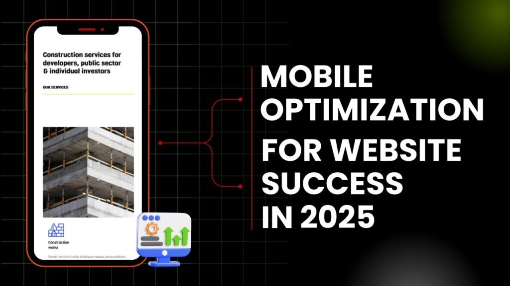
Mobile Optimization for Website Success in 2025
You scroll. You tap. You buy. That’s how today’s world moves and your audience is doing exactly that from the palm of their hand. In 2025, mobile optimization for website performance isn’t just important but absolutely necessary. So whether you run a cozy neighborhood cafe or a fast-growing online store, your customers are reaching for their phones to connect with you. And if your website isn’t ready for that experience? You’re not just losing traffic, you’re losing trust, conversions, and revenue. Today, people expect fast, smooth, mobile-friendly website experiences. They want to scroll, tap, and shop without frustration. In this guide, we’ll walk you through how to optimize for mobile devices using practical advice, friendly insights, and the mobile optimization best practices that actually matter. Why Mobile Optimization Matters in 2025 Let’s be real – your audience is mostly on their phones. The following explains why mobile optimization is now essential for website performance: Over 60% of all web traffic comes from mobile devices. If your site isn’t mobile-ready, you’re missing a big piece of the pie. Google ranks your mobile site first. Mobile-first indexing means your mobile version is what Google uses to decide your rankings. People usually take 0.05 seconds to determine if your site is reliable. On mobile, speed and layout make all the difference. A mobile-friendly website respects your visitors’ time. It’s not about flashy designs – it’s about making it easy to navigate, scroll, and take action. How to Know If Your Website Needs Mobile Work You don’t need to be a tech expert to spot mobile issues. Ask yourself: Is the text hard to read without zooming? Are buttons too small or too close together? Does your site take too long to load? Do things look weird or broken on a phone screen? Is the navigation too clunky? If you answered yes to any of these, it’s time for a mobile refresh. Applying mobile optimization best practices will help you fix these hiccups. What Makes a Mobile-Friendly Website? Let’s break it down. A mobile-friendly website is designed to operate smoothly and look welcoming on any screen. Responsive Design Your website should adapt to all screen sizes, from tiny smartphones to large tablets. That means images, menus, and content should all resize automatically. Fast Load Times Nobody likes waiting. Optimize your images, reduce unnecessary scripts, and use tools like Google PageSpeed Insights to stay under 3 seconds. Thumb-Friendly Navigation Big buttons, clean menus, and key actions within reach of the thumb – that’s how to optimize for mobile devices in a way that feels natural. Readable Content Choose font sizes that are easy to read and space your content well. Make it skimmable by using headings, bullet points, and brief paragraphs. Mobile-Enhanced Features Click-to-call buttons Embedded maps WhatsApp or Messenger links. These little touches go a long way in creating a smoother user journey. Mobile Optimization for E-commerce For online stores, mobile optimization for website functionality is the difference between a sale and an abandoned cart. Use high-quality but fast-loading images Keep the checkout process short and simple Accept digital wallets such as Google Pay and Apple Pay Add live chat or instant messaging options These mobile optimization best practices help convert casual browsers into loyal customers. How Mobile Optimization Affects Your SEO Mobile SEO tips are more relevant than ever. Here’s how optimization boosts your visibility: Google ranks better-optimized sites higher Faster load times and better UX reduce bounce rates Well-optimized mobile pages increase engagement Use mobile SEO tips like compressing images, avoiding pop-ups, and using clean code to improve both user experience and rankings. Tools to Check Your Mobile Readiness You don’t need to spend long hours identifying if your site is responsive and mobile-friendly. Use these tools: Google Mobile-Friendly Test: Quick overview of usability GTmetrix: Load times and improvement tips PageSpeed Insights: In-depth performance scores BrowserStack: Simulate your site across different devices Regular testing keeps your site running smoothly and aligned with the best practices of mobile optimization for website. A Quick Real-Life Example +.3 Imagine you own a small pottery business in Pune. On the desktop, your website looks amazing. But on mobile: The images take forever to load Buttons are hard to tap The contact form is clunky Now, imagine fixing those things. Suddenly: The gallery loads instantly The call-to-action is easy to tap Customers can contact you with one click This kind of mobile-friendly website design turns curiosity into conversions. What’s New in 2025 for Mobile Optimization Trends are always evolving. Stay ahead with these updates: Voice Search Optimization: More users are speaking their searches. Therefore, optimize your content for natural, conversational phrases like “Hey Google, find a nearby café.” Dark Mode Support: Better for low-light browsing. Dark mode reduces eye strain in low light and gives your site a sleek, modern look that users appreciate. AI-Driven Personalization: Use AI to tailor the user experience. Think of customized product recommendations, location-based offers, and personalized content. Minimal Design: A clean, clutter-free interface loads faster, looks professional, and helps users focus on what really matters. Progressive Web Apps (PWAs): Give users an app-like experience, such as fast loading, offline access, and smooth interactions, without making them install anything. These trends make your site feel more modern, efficient, and user-friendly. Mistakes to Avoid Even with the best intentions, it’s easy to slip up when doing mobile optimization for website. Watch out for: Desktop pop-ups that block the mobile screen Forgetting to test responsiveness Ignoring accessibility features like alt text or screen reader support Skipping mobile checks after website updates Each of these can hurt user experience and SEO, so stay proactive. The Business Benefits of Mobile Optimization When your site is mobile-ready, great things happen: Visitors stay longer Search rankings improve Conversions increase Your brand feels more trustworthy You display the importance of your audience when you optimize for mobile devices. Mobile optimization for website performance in 2025 is more than a technical tweak, and hence it’s a must-have. Whether you’re